Visualizing the Internet (2023)
10 minutes 2,045 words
2023-08-01 (updated: 2024-04-21 17:28)
I recently expanded on my Internet map visualization that showed all of the undersea internet cables that run along the bottom of the oceans and seas. This time, I also added dots that represent the locations of all of the advertised internet exchanges in the world. The brighter/greener/bigger the dot, the more bandwidth the internet exchange supports.

And here is the same map but without country borders. I think this one looks beautiful:
Click here for full resolution image (warning, it’s big)
Click here for full resolution image (no borders) (warning, this one is also big)
What’s an internet exchange?
Internet Exchange:
An internet exchange, often referred to as an Internet Exchange Point (IXP), is a physical infrastructure or facility where Internet Service Providers (ISPs) and other network operators connect their networks together to exchange Internet traffic. The primary purpose of an internet exchange is to improve the efficiency of data exchange between different networks by allowing direct peering between them. Instead of sending data through multiple third-party networks, which can lead to increased latency and costs, ISPs can directly exchange traffic at an internet exchange, resulting in faster and more cost-effective data transmission.
Internet exchanges play a crucial role in the functioning of the global internet. By facilitating direct peering, they help reduce the reliance on expensive long-distance links and enhance the overall performance and resilience of the internet. They also promote competition among ISPs and encourage the growth of internet infrastructure in specific regions.
Traceroute Command:
The traceroute command is a network diagnostic tool used to trace the route that data packets take from one computer to another across a network, typically the Internet. It helps identify the network path taken by the data, showing the sequence of intermediate devices (routers) that the packets pass through before reaching the destination.
$ sudo mtr apple.com
                            My traceroute  [v0.95]
kevins-mbp-m1.local (192.168.88.31) -> apple.com (17.22023-08-02T13:19:54+0200
Keys:  Help   Display mode   Restart statistics   Order of fields   quit
                                      Packets               Pings
 Host                               Loss%   Snt   Last   Avg  Best  Wrst StDev
 1. router.lan                       0.0%     5    5.2   4.8   4.3   5.2   0.4
 2. 10.24.0.1                        0.0%     4    4.7   4.6   4.3   5.0   0.3
 3. soeborg2.net.gigabit.dk          0.0%     4    5.6   6.6   5.5   9.7   2.1
 4. apple-1.equinix-am1.nl-ix.net    0.0%     4   15.6  15.5  14.1  16.6   1.0
 5. apple.com.sg                     0.0%     4   15.2  15.0  14.5  15.6   0.5
In the provided example output:
kevins-mbp-m1.localis the name of the source host or the computer from which thetracerouteis initiated. That’s my laptop, so I know that it is located in Copenhagen, Denmark.apple.comis the destination host or the target server to which thetracerouteis being performed.
The columns in the output represent the following information:
Host: The intermediate routers or nodes in the network path.Loss%: The percentage of packet loss experienced while reaching each router.Snt: The number of packets sent to each router.Last: The last round-trip time taken to reach the router.Avg: The average round-trip time to reach the router.Best: The best (minimum) round-trip time to reach the router.Wrst: The worst (maximum) round-trip time to reach the router.StDev: The standard deviation of round-trip times to the router.
Identifying Exchange Location using Reverse IP Lookup:
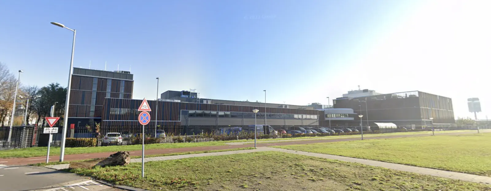
In the traceroute output, you can sometimes infer the location of an internet exchange based on the names of the intermediate routers. Many internet exchanges are named explicitly to indicate their location. For example, in the provided traceroute, the router with the name apple-1.equinix-am1.nl-ix.net suggests that it is associated with the Equinix Amsterdam (AM1) data center connected through the NL-IX internet exchange. So my request was probably handled inside of Luttenbergweg 4, Amsterdam, Netherlands or… this building:
However, it’s important to note that not all routers or nodes in a traceroute will have such descriptive names. Some routers might be labeled with IP addresses or generic names that do not reveal their location. In such cases, it becomes more challenging to pinpoint the exact location of an internet exchange solely based on the traceroute output. Additionally, the reverse IP lookup method depends on the accuracy and up-to-date information in the IP address registries, and some routers might not be accurately represented.
Because of all of this, we can see the path that is taken when connecting to a server, which I think is really cool. With my example, I can know that it takes around 15.5 milliseconds for my network traffic to reach the Netherlands and I can tell that Apple is peering directly in this facility. You can verify this fact by looking at PeeringDB. Essentially, if you want apple.com to load faster for your users who are near(ish) to Amsterdam, you may want to run some fiber optic cable to this internet exchange. Put another way, the closer you are to the dots the closer you are to the internet.
Observations from the map
Now here’s the pretty part. Here are close-ups of different parts of the map with some general observations.

North America
The internet exchanges in North American look how I’d imagine them. There are more and higher bandwidth internet exchanges on the eastern side of the US and a good amount along the west coast. However, there are some very important internet exchanges in Colorado. It likely serves as a good halfway point between east and west to transition traffic to different backbone providers.

Europe
After seeing the map from North America it’s rather surprising to see how dense European internet exchanges are. There’s almost too much to comment on here but I will say that it’s interesting how important Amsterdam, Frankfurt, and London are.
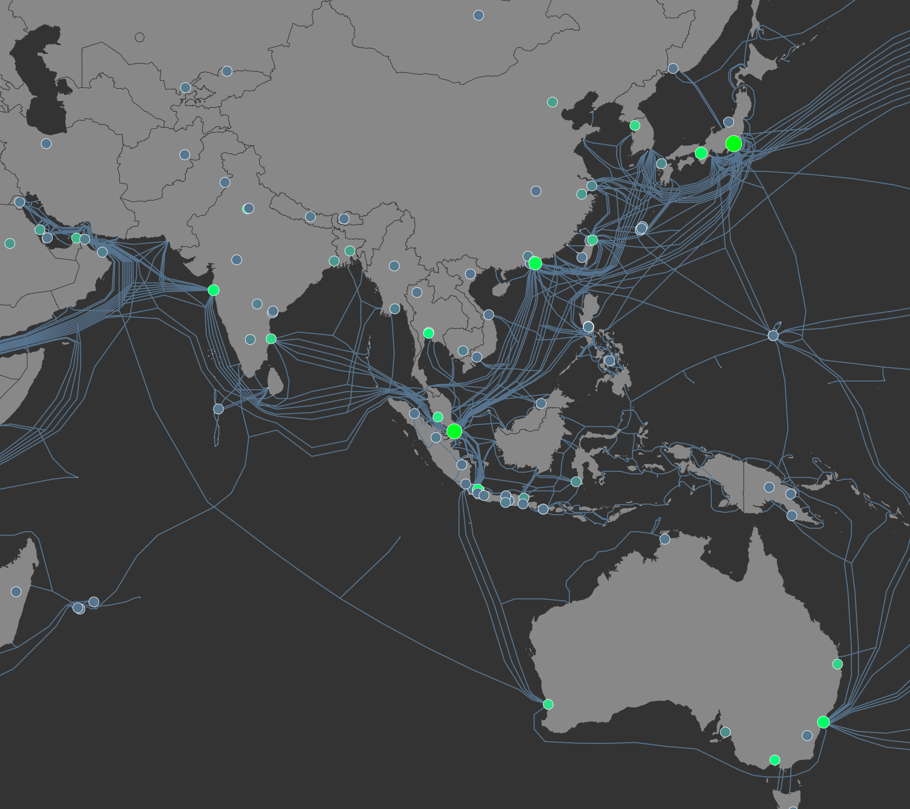
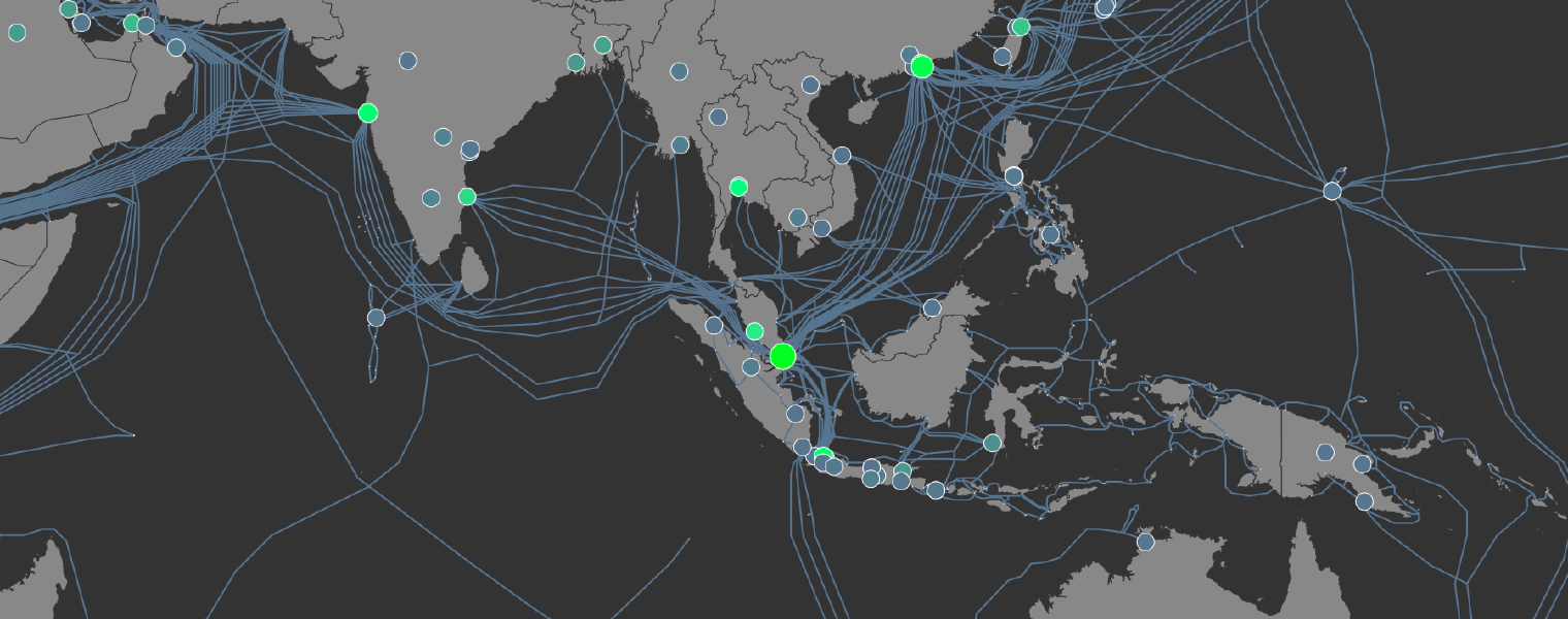
Asia-Pacific
The area around Asia looks rather crazy, but it’s important to note that fiber links can visit islands along the way in order to give them internet access. Those islands will have networking gear that ‘drops’ and ‘adds’ certain channels of the signal. The network device is typically a ROADM (reconfigurable optical add-drop multiplexer). I bet you can guess why they made that an acronym. Also, I think open peering in China is not really a thing as I believe most traffic goes through so-called backbone providers instead of through internet exchanges. This is likely related to the great firewall of China. On the map, you only see a good number of internet exchanges in Hong Kong.

Africa
Africa has many optical cables that travel along coasts. I suspect the terrestrial optical networks aren’t as well developed in most parts of Africa. There are exceptions though. There is a lot of bandwidth capacity in internet exchanges in Capetown and Pretoria. Also, it’s crazy to see how many optical cables lie at the bottom of the Suez canal.
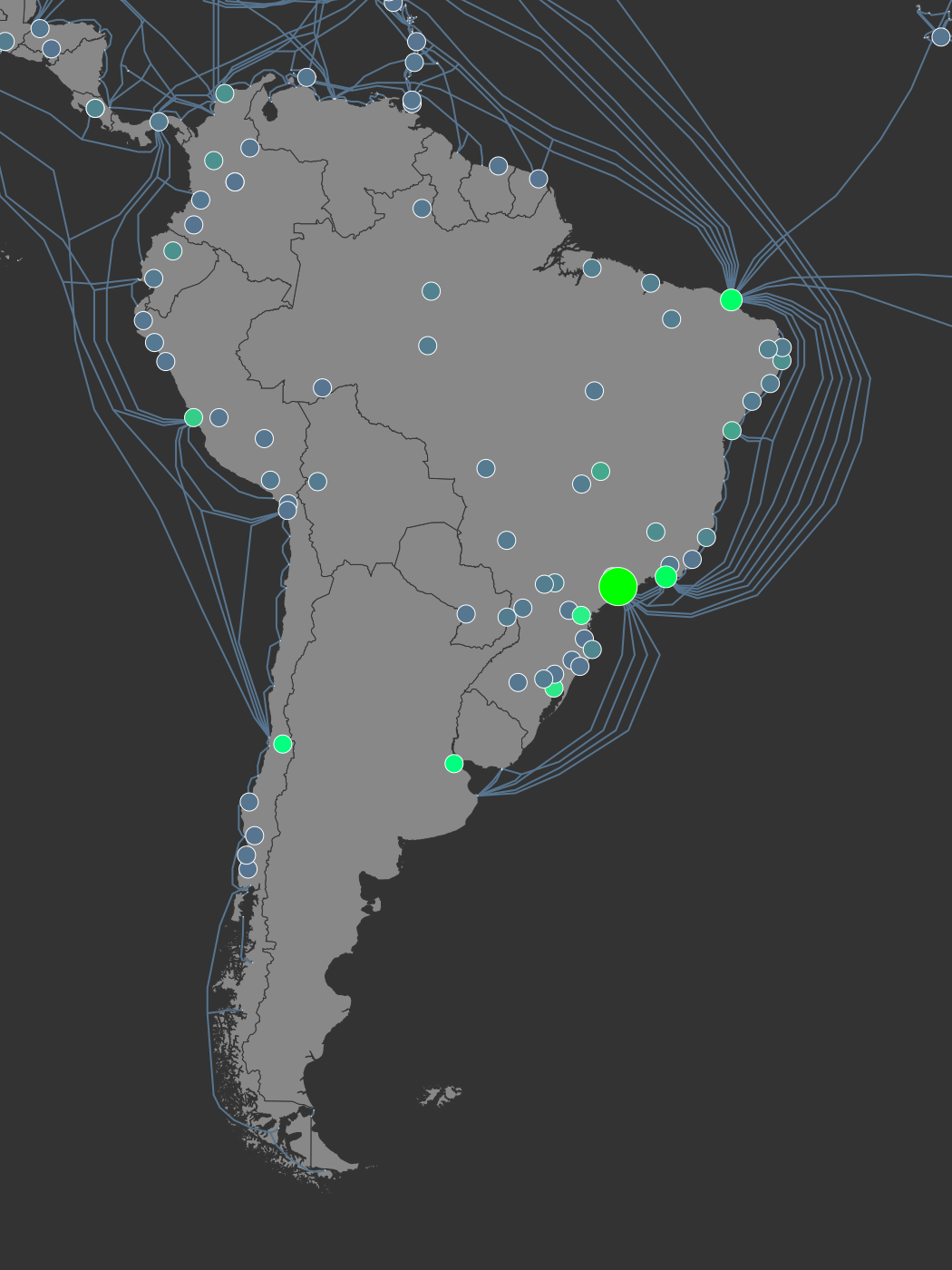
South America
In South America we have Fortaleza and Sao Paula have a lot of landings and internet exchanges.

Svalbard
Svalbard is a set of islands owned by Norway that is waaay far north. It’s one of those places that gets 6 months of day followed by 6 months of night. And it’s always super cold. It’s interesting to see two undersea cables to a place like this. Svalbard is where the global seed vault lives, with seeds from all over the world. If you want to use these two cables you can check out some webcams that are set up in Svalbard.
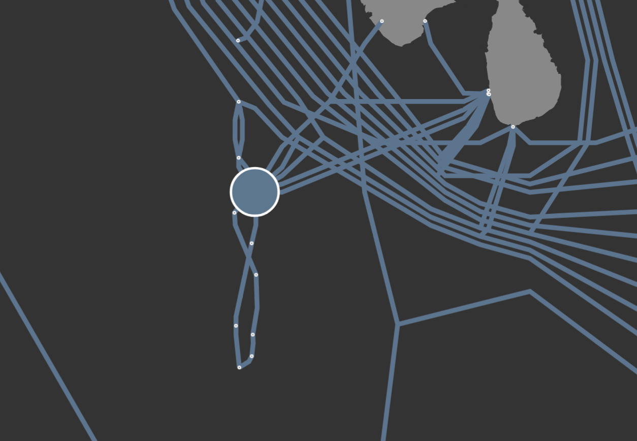
Maldives
Maldives is another interesting place where fiber optic cables live. You might notice that the fiber optic cables cross each other. It appears that it was done in order to connect islands that the first cable didn’t service before. The cables were commissioned around 5 years apart. It must have been a hard 5 years if you lived on one of the islands that didn’t get high speed internet on the first round.
How it’s made
First, this is where I got the data from:
- PeeringDB - PeeringDB is a user-driven database that offers information about network interconnection facilities and peering arrangements, supporting network administrators in optimizing Internet connectivity.
- Simple Maps - I used this dataset to geolocate all internet exchanges in PeeringDB using the city and country fields.
- Submarine Cable Map - TeleGeography maintains a database of all major submarine fiber optic cables and their status.
Next, these are the different tools/languages that I used:
- Javascript (nodejs)
- D3 - D3.js is a powerful JavaScript library for data visualization that allows developers to create interactive and dynamic charts, graphs, and other visual representations on the web using HTML, SVG, and CSS.
- d3-node - a library that helps with running d3 inside of a nodejs environment
- d3-geo - a library that handles translating coordinates for different map projections. I know it’s controversial now, but the Earth isn’t flat. So to make a flat image you have to pick how you are going to translate the globe coordinates onto a map. Despite its flaws, I used the Mercator projection because it is by far the most popular map projection.
- D3 - D3.js is a powerful JavaScript library for data visualization that allows developers to create interactive and dynamic charts, graphs, and other visual representations on the web using HTML, SVG, and CSS.
- The Go Programming Language - This is my current working language, so it’s what I used to integrate with the PeeringDB API and do some data processing/validation.
- PeeringDB - A library for talking to the PeeringDB API.
The pipeline looks like this:
graph LR
    submarinecables[Submarine Cable Database] --> golang[Go Script]
    peeringdb[PeeringDB] --> golang[Go Script]
    geocities[Geolocation Database] --> golang[Go Script]
    golang[Go Script] --> node[Node JS Script]
    node[Node JS Script] --> svg[SVG]
    svg[SVG] --> convert[ImageMagick Convert] --> png[PNG]
    svg[SVG] --> morgify[ImageMagick Morgify] --> jpg[Displate JPG]
    style svg stroke:#f66,stroke-width:2px,stroke-dasharray: 5, 5;
    style jpg stroke:#f66,stroke-width:2px,stroke-dasharray: 5, 5;
    style png stroke:#f66,stroke-width:2px,stroke-dasharray: 5, 5;
Mapping of Cities to lat/long GPS coordinates
I had so many data validation issues when doing this project. I should have expected this more since PeeringDB is user-managed and there’s no validation of the City field.
I had a lot of random issues mapping internet exchanges with their GPS coordinates. First, the geolocation database I was using is not complete. It only has around 43 thousand cities but there are many, many more towns and cities. The way I handled that was to manually map to the closest city that I do have geo coordinates. Additionally, the city field would be misspelled, formatted in a way differently than my database or the name of the city may have changed. This happens a lot because there are usually multiple ways to convert many languages into Latin characters. And sometimes cities just change their names. All-in-all I have 95 internet exchanges that I have had to manually map. I can’t guarantee that they are all correct… but it is good enough. You can see all of the places that I manually mapped on github.
Here are my favorites:
- There were a few exchanges that spelled their city and sometimes the name of the exchange incorrectly. I’ve sent a few emails to make them aware and a few have fixed it!
- There is an exchange named “Example IX” which is obviously just used as an example: entry on PeeringDB
- The accepted Western name for the capital city of Ukraine changed from Kiev to Kyiv due to the efforts of a campaign called KyivNotKiev. There are several internet exchanges still using the old spelling in its address.
Thanks for reading
So far I’m pretty happy with the results of this little project. If I were to work more on this I would want there to be an actual heatmap instead of just drawing dots. I have attempted to do this but it was taking too long to figure out how to properly do it specifically with the node-d3 library. Also, there’s probably a lot of data validation that I could do… but I do feel like it’s not my job to fix this database so I’m probably not going to do that for the sake of a small side project.
The part that is missing still is the terrestrial fiber links. There’s not good public data on those for several reasons, but you can be assured that there are significant backbone fiber optic cables buried nearby almost every major highway and rail line in the US. So imagine lines that nearly mimic the US road system and you’ll have an idea of what that map would look like. That may be the next step for this map since it’s a bit hard to understand that we only have undersea cables.
References:
- Github: https://github.com/sudorandom/submarine-cable-map
- PeeringDB: https://www.peeringdb.com/
- Simple Maps (Geolocation Database): https://simplemaps.com/data/world-cities
- Submarine Cable Map: https://www.submarinecablemap.com

📝: Visualizing the Internet (2023) #dataviz #internet #networking #fiber-optics #map #world #infrastructure #peeringdb #svg #javascript #golang https://sudorandom.dev/posts/internet-map-2023/